
Accessibility Evaluation
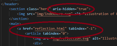
We have designed this website with accessibility in mind. We have used best practice semantics in the html code hierarchy. Instead of divs we used the new types of elements like "header", "nav", "main" and "footer" for the layout, while "section" and "article" elements are used for content. This makes it easy for screen readers as well as search engines to understand the contents of the page. Because we had this in mind from the very start, the website passed accessibility checks without necessary revision. The site contains several images that serve no other purpose than visual design, and these are hidden from screen readers with “aria-hidden”. We have used “tabindex” and “:focus” to enable tab navigation that gives the same visual feedback on focus as on hover. We have checked the page for color-blindness accessibility on toptal.com and detected no issues and checked contrast and text size on webaim.com and passed AAA.
The website is mainly in English and the universal language is therefore specified in the html tag as "lang=en". There are some texts which are in Norwegian and those articles are specified as "lang=no". This is in accordance with WCAG guidlines for language. There are no keyboard traps on the site because the page is fairly simple without forms or input. There is no playable media or animations on the site so there are no issues with stopping or pausing. There are some animations on hover and on focus, but these animations are not flashing or changing color, and it is for user information purposes. Overall we have followed WCAG guidelines and we believe we have met the requirements for minimum WCAG level AA on the whole site.
When it comes to design we have tried to make the site minimalistic and intuitive. There are two ways to navigate, and both give visual feedback so that the user knows what functionality to expect. We have also made sure that no design feature is necessary for the site to work and be navigated properly.